Behavioural User Archetype Synthesis
Transforming a 15-page PDF application form for a grant serving seniors into a streamlined 7-page webform, contributing to policy and organizational changes at the Ministry level.
Organization
Ontario Digital Service
Timeline
September 2023 - January 2024
Role
Led user research, project coordination, client engagement, prototyping and content re-design
Tools
Figma, Miro, Alchemer
The Brief
The Seniors Community Grant Program funds local not-for-profit community groups and organizations to deliver projects that help older adults (aged 55+).
During the fall 2023, I worked with the Ministry for Seniors and Accessibility and the Ministry of Tourism, Culture and Sport to re-design their Seniors Community Grants application form to better meet the needs of applicants.
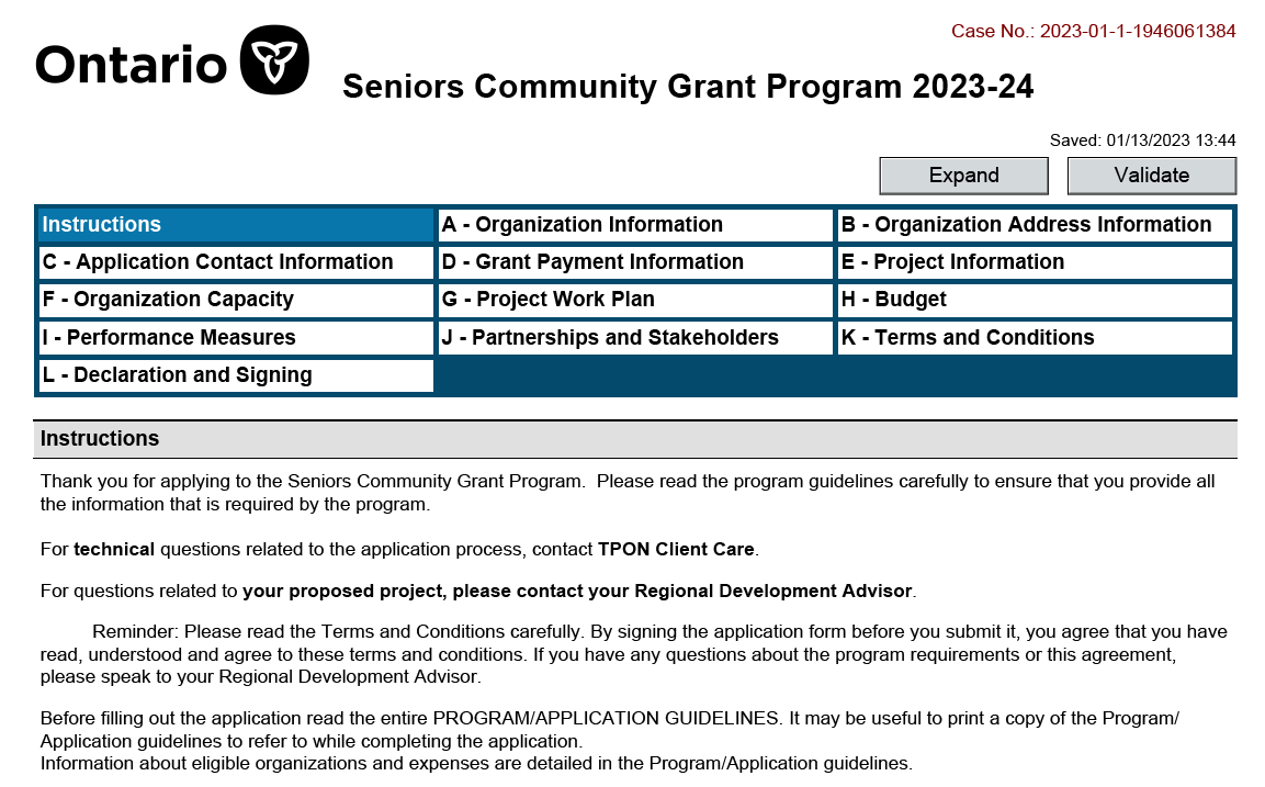
To apply for the program, representatives from seniors' groups and not-for-profit organizations have to complete a cumbersome 15-page PDF application form, and review a 22-page guideline document. At the time, there was a 30-40% high error rate, which led to funding delays and project cancellations.
Our Goals
To expand our understanding of the problem space, we needed to:
Understand how the data collected from the application form is used
Understand users' past experiences with the MSAA Seniors Community Grants application form
Gather applicant expectations, and identify any areas of confusion.
"Let's remember that this is a program for seniors and about seniors. Applicants write fantastic proposals about phenomenal projects that will genuinely improve communities … Because they have to face this application, there are difficulties … projects are delayed, and they have to cancel their projects. We’re setting them up for failure.”
— Grant Coordinator
001: Heuristic Evaluation
To start, I conducted a heuristic evaluation of the PDF application form to surface key content and usability issues.
The heuristic evaluation was informed by form guidance outlined in the Ontario Design System, which includes a set of pre-built components and styles that ministries can use across government to design websites and applications.
1. Rigid input fields
Key sections of the form include single-line inputs, small text fields, and applicants are often unable to add more rows to tables if desired.
2. Irrelevant sections
Applicants are asked to provide payment information in their application form, which should be requested after their projects have been approved.
3. Unfamiliar terminology
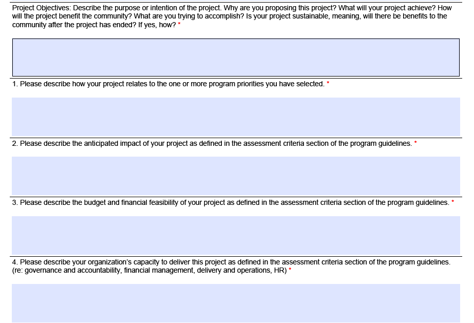
Some sections of the work plan (e.g. performance indicator, responsibility) are difficult to understand, and there is no detail provided to help users. Acronyms are used throughout, which can cause user confusion (e.g. TPON for Transfer Payment Ontario).
4. External documentation
There is minimal external documentation, including key details from the 22-page guideline document. Applicants are often asked to refer to outside criteria and documentation within the application.


002: Research
Part 1: The Stakeholders
To better understand the context that surrounds the application process, and how applications were evaluated, we facilitated two half-day research workshops with 5 staff who evaluate the submitted applications. We used an interactive Miro board to:
Identify the steps involved in the evaluation of applications, actors involved and tasks
Understand the purpose and use of information gathered through the application form, how the questions in the form contribute to funding recommendations, and the common errors applicants made
Part 2: The Users
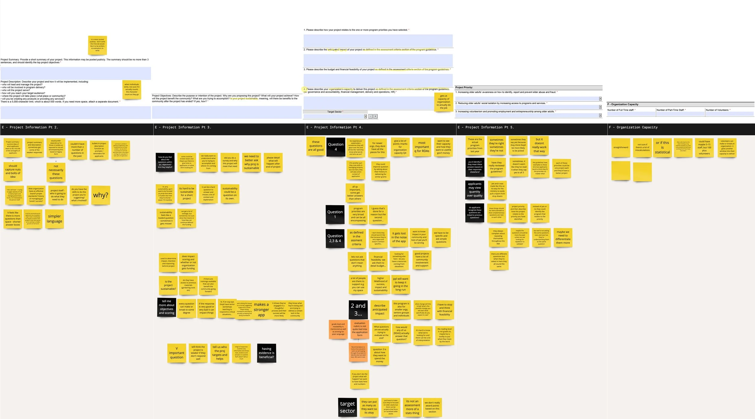
Next, we wanted to understand some of the pain points applicants experience when completing the form. We held 13 content testing sessions with applicants. We asked them to:
Share their past experiences completing the application form in a semi-structured interview
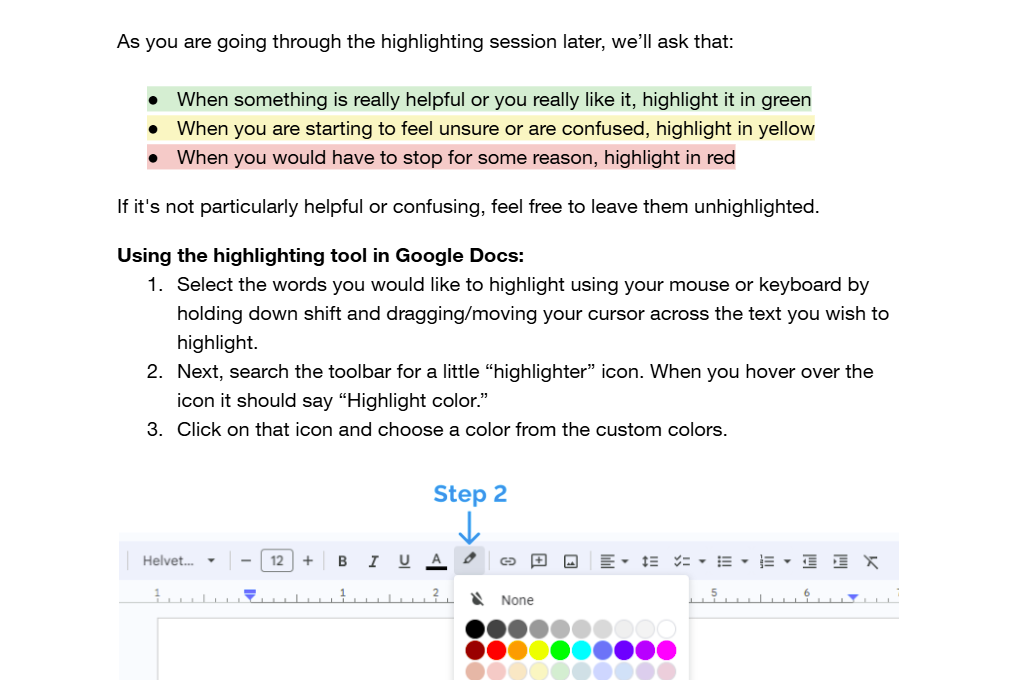
Complete a highlighter test in a Google Docs form of the PDF
003: Key Issues
Irrelevant sections
Some compulsory questions were not relevant to all projects. Several applicants indicated that some of the questions and instructions in the application didn't feel relevant to their unique settings, or were asked too early.
Fragmented form structure
Applicants shared feeling that they were getting asked very similar questions throughout the application, making them them doubt that they were filling sections correctly.
Inaccessible format
The form was not compatible with most PDF viewers, resulting in technical issues for many applicants.
Unclear criteria
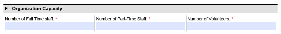
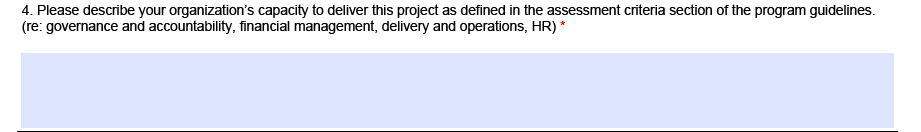
Applicants struggled to understand what to prioritize. Sections such as organizational capacity are weighed heavily during the evaluation process, yet the importance placed on the question and the level of detail required is not clear to applicants.
Complex and unfamiliar language
Several participants struggled to understand jargon-heavy and technical language in the application form, causing them to leave the form to google the terms.
Ambiguous questions
There was a mismatch between the answers evaluators expected and how applicants understood questions, especially concerning project priorities.
004: Co-creation
Next, our team brought together four evaluators and two applicants together to brainstorm changes to the Seniors Community Grants application form in a half-day co-creation workshop.
As a group, we walked through the form using a set of guiding design principles — developed based on the analysis of our findings — to collaboratively develop an ideal end-state for the form.
"I would like to take a moment to appreciate this. This is great work we are doing today and I am very happy to be a part of this process. Thank you very much for this platform!”
— Grant Coordinator
005: Service design changes
Working closely with the Ministry of Seniors and Accessibility, we were able to achieve three main outcomes.
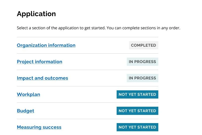
Transition to modern webform
The Ministry used the available technical ecosystems to move from the PDF format to a modern webform built using the Ontario Design System. The change both resolved pain points identified during testing related to PDF compatibility but also introduced an HTML-based system that was more flexible and accessible.
Updated evaluation process
The transformation of the form’s sections and questions required updates to the existing evaluation documents and processes, since previous methods were no longer applicable. We gained the team’s commitment to ensure that the evaluation process would be clearer.
Policy changes to budget evaluation
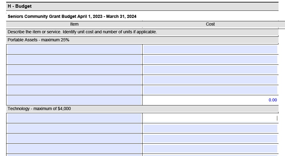
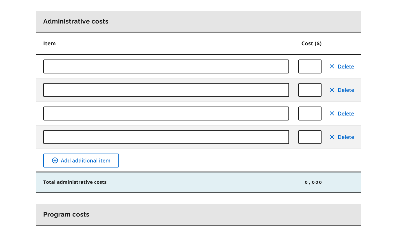
Our work also resulted in policy changes to the grant that revised how budgets are evaluated. By removing complex budget categories and limits, we gave applicants greater freedom to include expenses relevant to their projects, so the application better reflects the diversity of submissions.
006: Form changes
Our final design was guided by four design principles, shown below with some example screenshots.
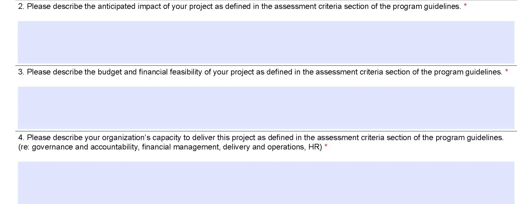
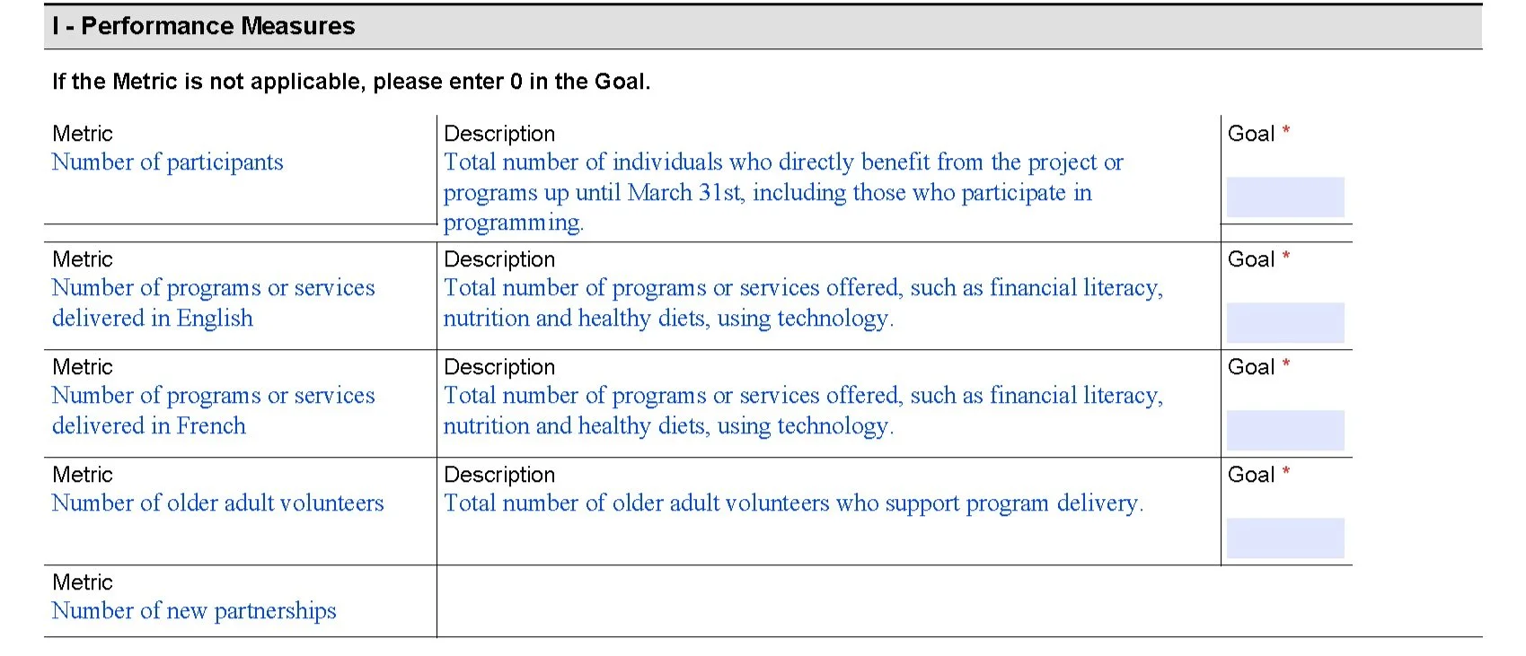
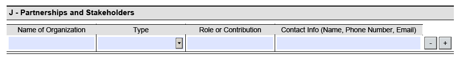
Relevance: Streamlining the form
We focused on only asking participants what is relevant at this time. By streamlining the application and removing redundancy, we reduced the number of sections in the form from 12 sections to 6, and from 96 questions to 24 questions, keeping key inquiries based on the evaluation criteria.
Before
After
Simplicity: Plain language
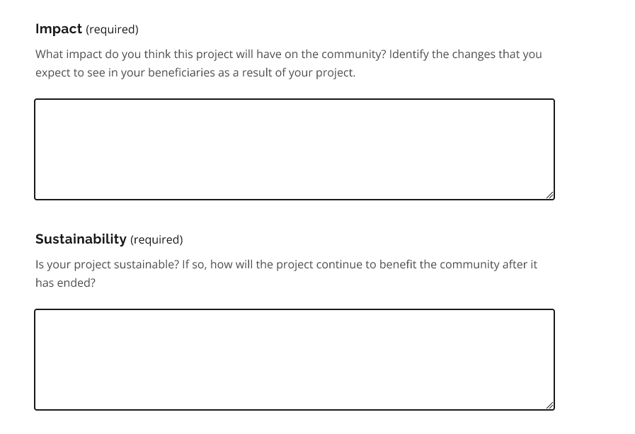
We aimed to make the application easy to use, understand, and to scan. Working closely with a content designer, we rewrote the copy, and removed confusing and ambiguous language, drawing on insights from highlighter testing.
Before
After
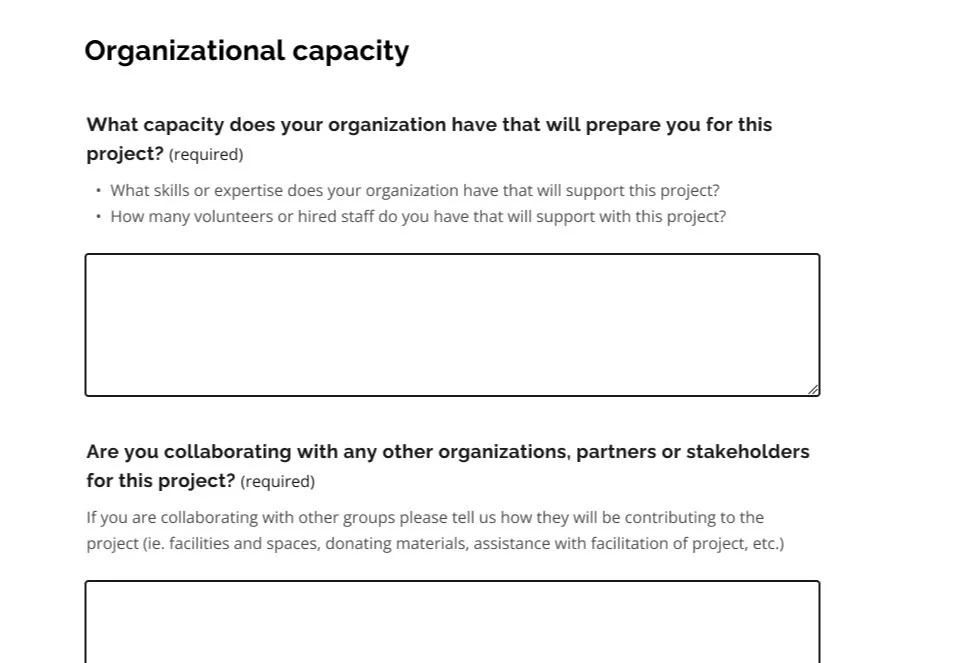
Flexibility: Applicable for all projects
We ensured that the application could cater to and accommodate the range of projects applicants brought by rewriting questions to be general without strict notions about what projects should look like, ensuring that applicants could tailor responses to their unique needs.
Before
After
Transparency: Knowing what to expect
To remove guesswork and doubt for applicants, we created clearly defined topics and questions and clustered questions related to the same criterion, based on discrepancies found during walkthroughs with applicants and evaluators.
Before
After

006: Reflections
Be prepared for the unexpected
Participants engage very differently with highlighter tests. While some participants were on top of the highlighting and talking as they went through the activity, others preferred to speak their thoughts aloud and would forget to highlight content that was confusing or helpful. It was critical for us to remain flexible and adjust on the fly - from offering support with highlighting from an observer, to troubleshooting technical problems.
Harness the power of co-creation
I also learned about the value of bringing together multiple stakeholders to guide the design process. Engaging in the ideation workshop at the end of the project not only provided us with a holistic view of what the application should look like, but it also aligned our research team, evaluators, and applicants on a path forward and set expectations for the condensed webform to come.