

First Post Office Museum Website
Working with Toronto’s First Post Office Museum to re-design their website to improve accessibility, navigation, and information hierarchy for museum-goers.
The Background
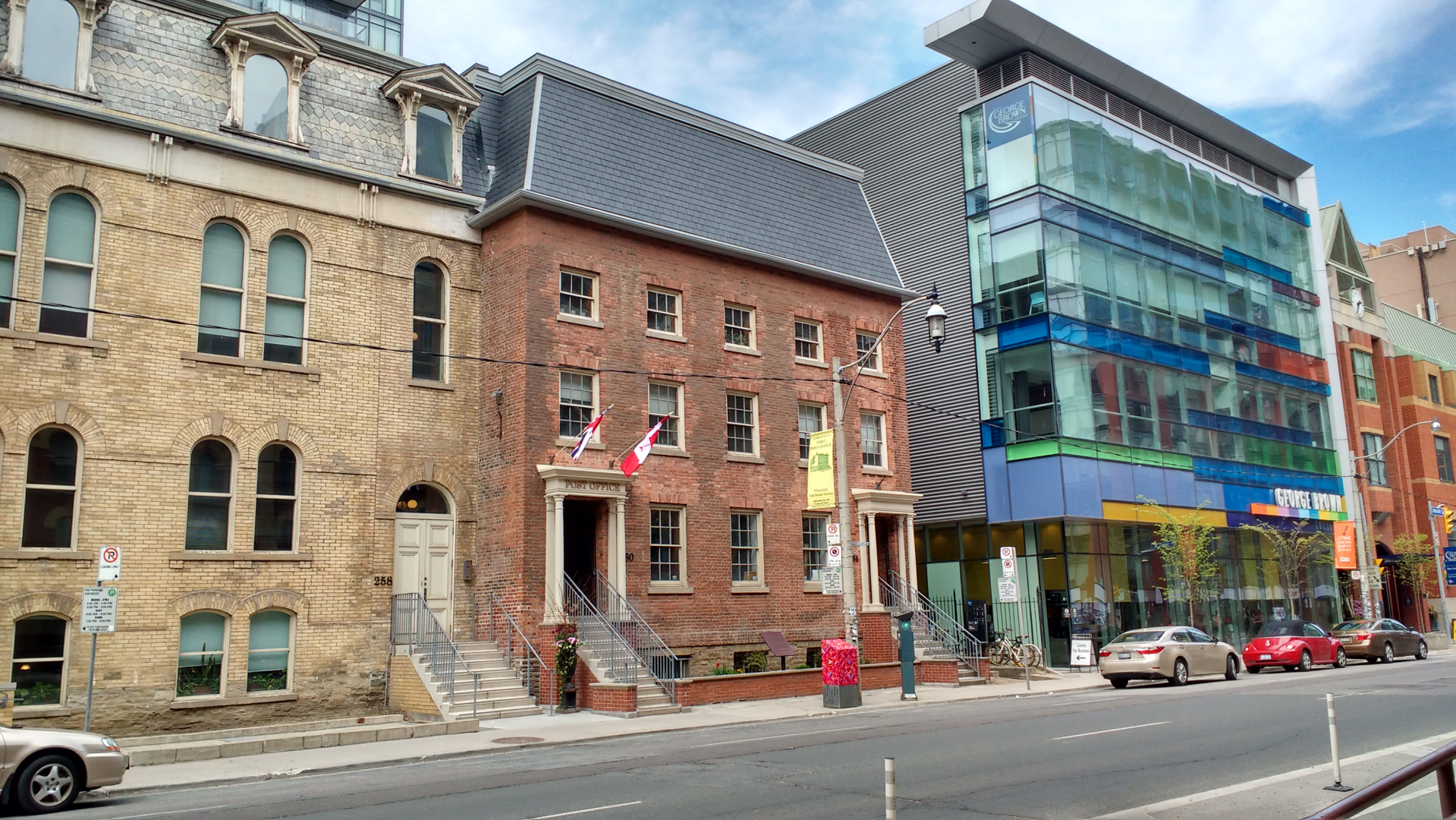
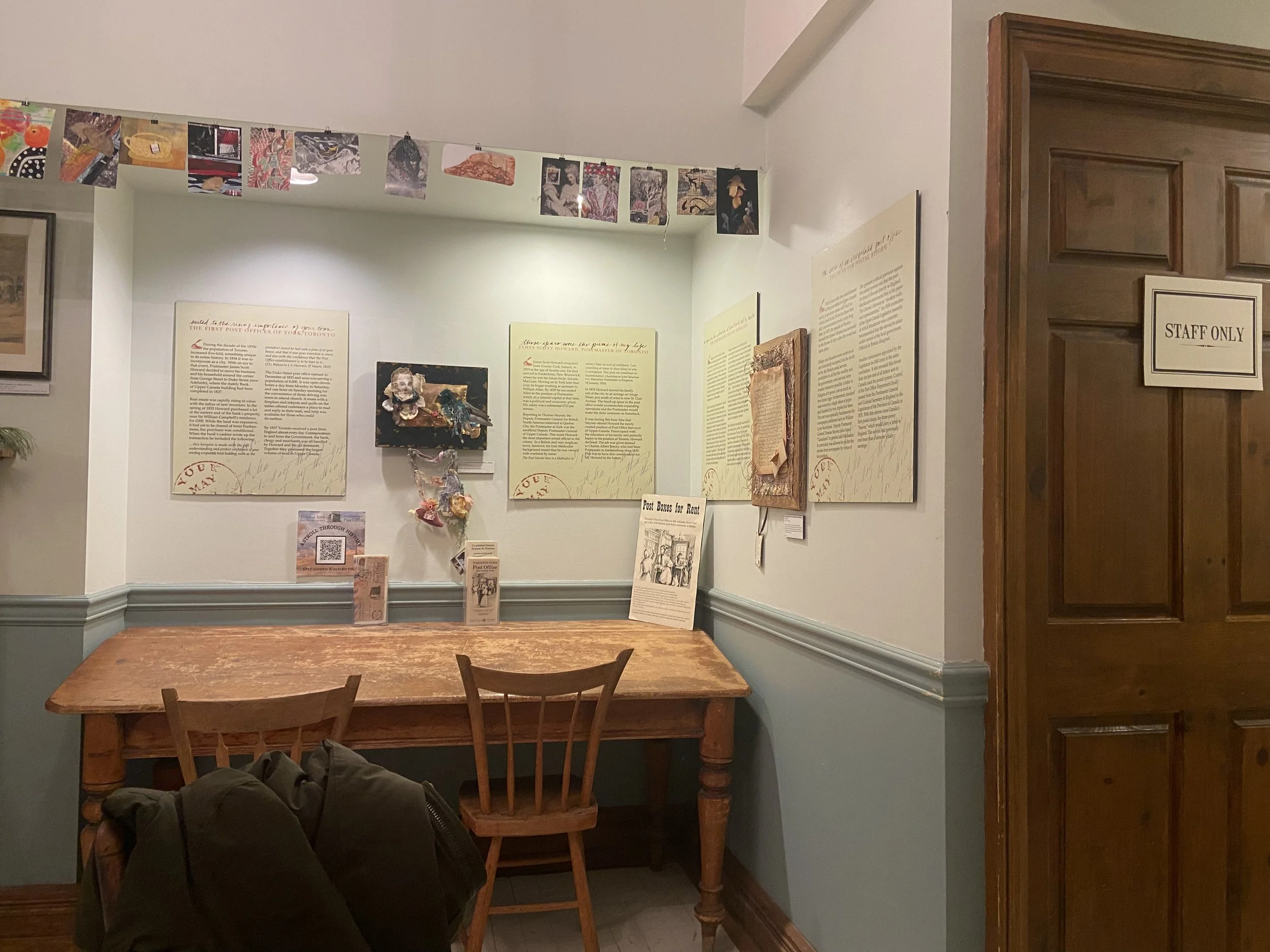
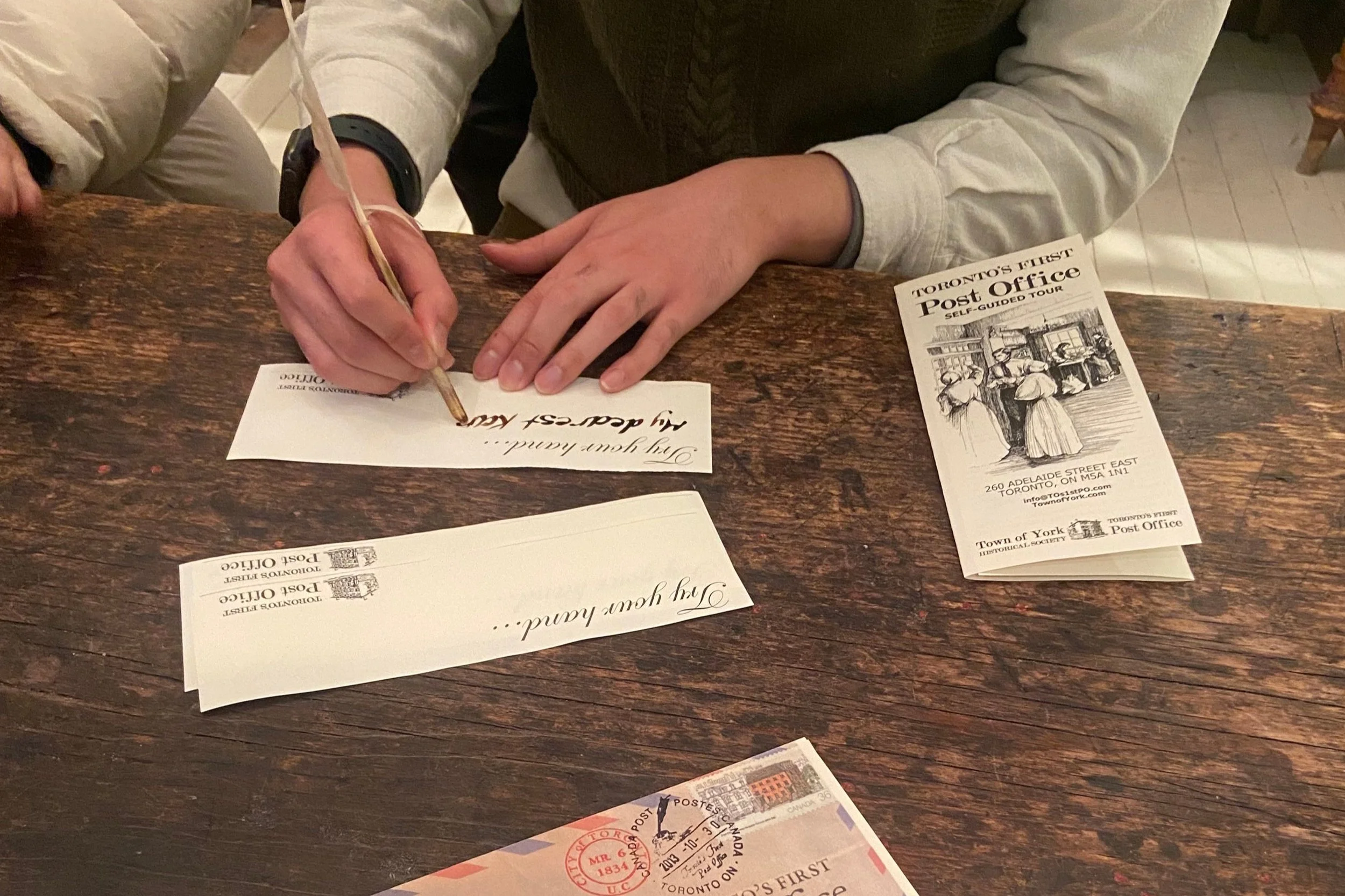
The Toronto First Post Office Museum (TFPO) is a historic post office in Toronto, a museum and a National Historic Site operated by the Town of York Historical Society. Their mission is to educate community members about the history of Toronto’s postal. The museum offers a wealth of events, collections, and exhibits - including the chance to try your hand at letter-writing with a quill pen and ink!
As part of my Capstone Master’s project, I worked with the TFPO museum to re-design their website to create a more unified and consistent website experience to engage community members, museum goers and students interested in Toronto's local history.
Role
Led user research, supported with stakeholder communications, evaluated research insights and defined features, reviewed the development of UI.
Tools
Figma, FigJam, Miro
Timeline
January 2024 - April 2024
The Problem
At the start of the engagement, the TFPO website navigation was unclear to museum-goers and community members. Museum goers struggled to understand what the museum offers, and they got lost easily and felt overwhelmed browsing through the virtual exhibits.
At the same time, TFPO’s current membership had been declining due to members’ ageing and moving out of the area. TFPO felt that it was important to attract new members to ensure the museum’s sustainability and enhance community engagement.
How might we redesign the TFPO museum website to attract members, and foster a sense of connection to the institution?
The Solution
Through background user research and primary user research such as interviews and think-aloud observation, we redesigned the website based on user needs, especially one that fits museum-goers in Toronto.
We also created low-fi, mid-fi and high-fi prototypes for the website based on a minimalistic design using the new navigation and labeling system we designed.
All these resulted in a clearer navigation experience for the museum-goers who seek to discover new cultural institutions in Toronto and to learn more about the city’s post office history.
The design was highly appreciated by museum staff, who are planning to implement changes in the near future.
Check out the high-fidelity prototype here.
001: Planning
We approached the problem in an iterative manner and design decisions were heavily based on research data. As part of our discovery process, we worked collaboratively with the Toronto First Post Office to map the stakeholders and users involved, and to chart a path forward for our research. We sought to achieve the following goals:
Organisational Context: Understand the priorities of TFPO museum staff, and the role of the website in their strategic vision.
Museum-goer expectations: Understand expectations from the website, and factors that influence the decision to visit the museum.
Website gaps: Identify key pain points and areas of confusion when navigating the website.
002: Primary Research
To better understand the problem space and to address the project goals, we began by holding semi-structured interviews and think-aloud observation with both stakeholders and users of the TFPO website:
2 Museum Coordinators
Manage collections, exhibitions, social media, programming, education, events, and the website.
1 Postal Store Clerks
Primary point of contact for visitors, leading day-to-day frontline operations.
1 Member of the Board of Directors
Guide museum’s strategic direction. Oversees governance and long-term success.
7 Museum Goers
Regularly engage with museums but has not engaged with TFPO.
3 Community Member
Paying member who is part of the Town of York Historical society.
003: Analysis
We conducted thematic analysis and inductively coded participant comments to identify emerging themes and patterns in FigJam.
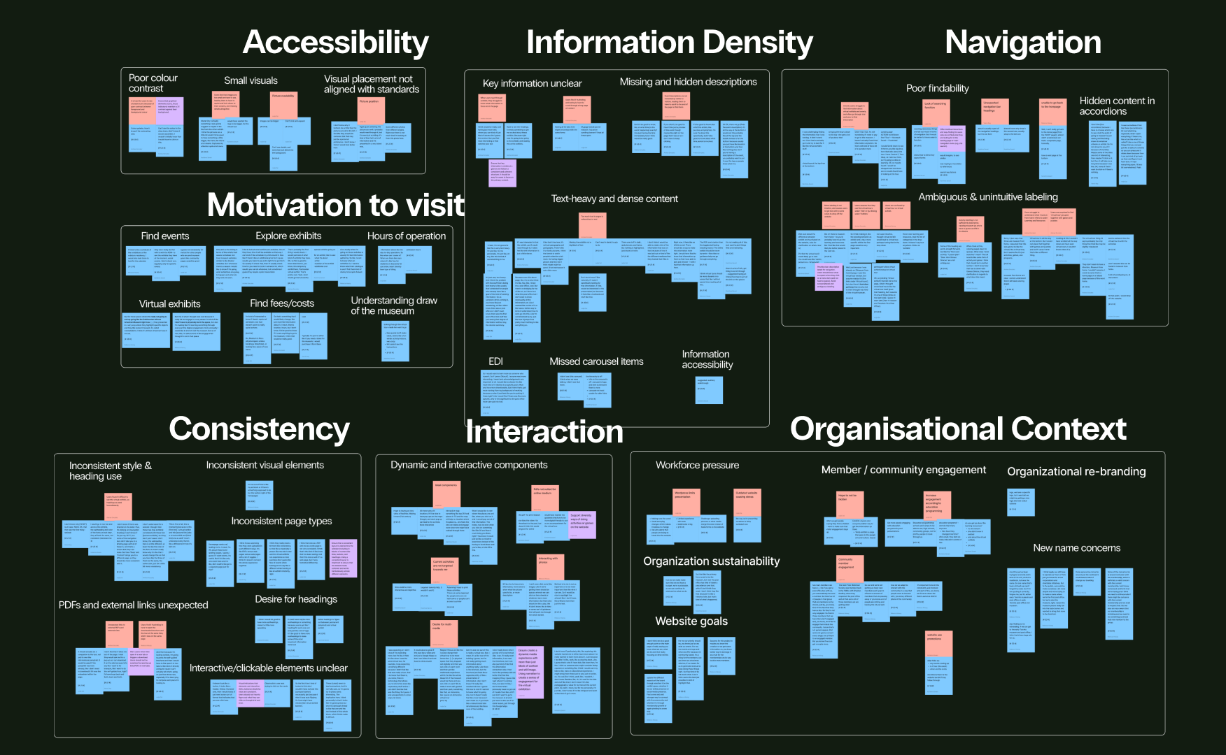
Unclear navigation
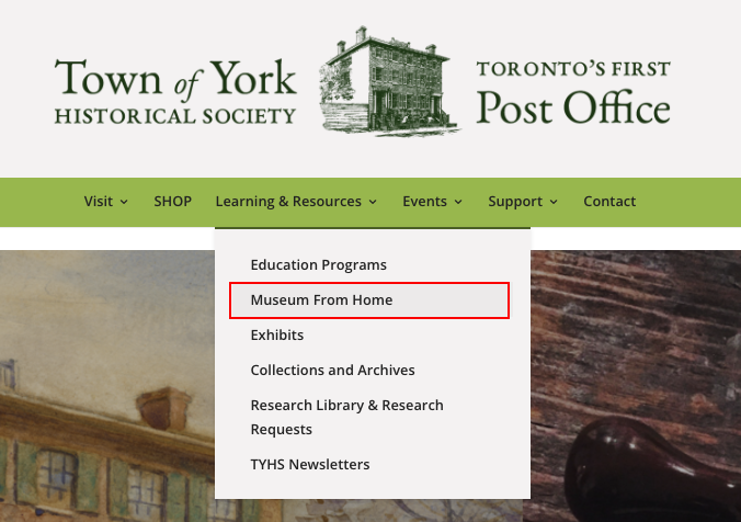
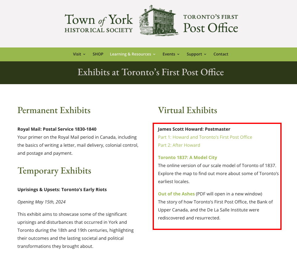
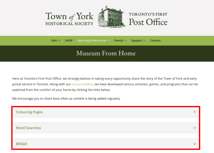
Ambiguous and unintuitive labeling in the website made it difficult for some users to locate information - expressions like “Museum from Home” often felt vague. Some felt that they had to go through trial and error to look for information.
Because of this, a few expressed that they would drop off if they were not in an interview.
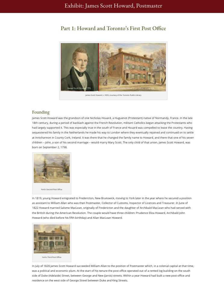
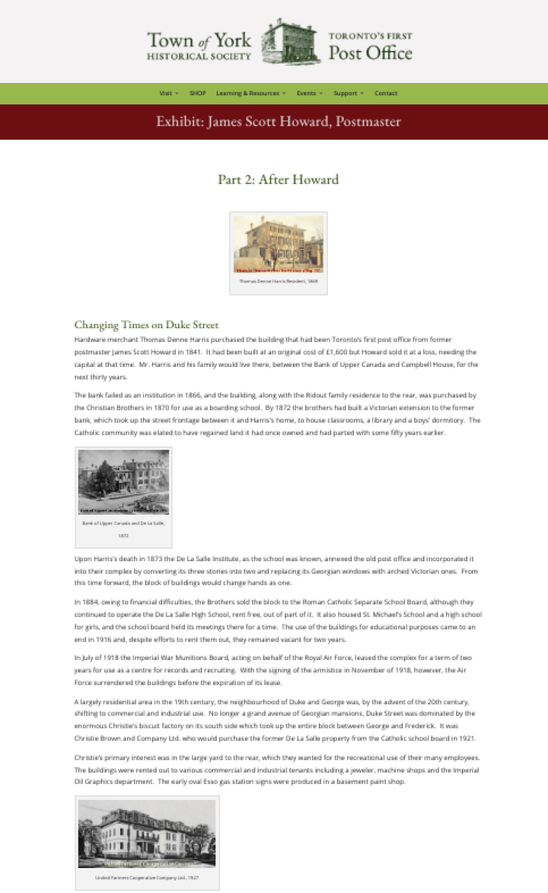
Information overload
Overwhelming amount of content in the Exhibits pages and lack of visual hierarchy made it challenging to extract relevant information and identify key information in exhibits
One user summed up this sentiment: “I’m not reading all of this, I just want to pick things that are interesting”.
Lack of consistency
Website style and design varied across pages, especially the presentation of headings and use of colour, leading to a disjointed experience.
Differences in the layout and colour scheme of the Virtual Exhibit headers and sub-headers led users to pause and often return to re-read the information.
Lack of accessibility
Users repeatedly shared that they had to squint to see text as the colour contrast was low, and they felt images and interactive elements (e.g., links, buttons, accordions) were small and unclear.
For example, the plus icon in the accordions is hard to see, leading users to frequently miss the opportunity to view the contents of accordions in more detail.
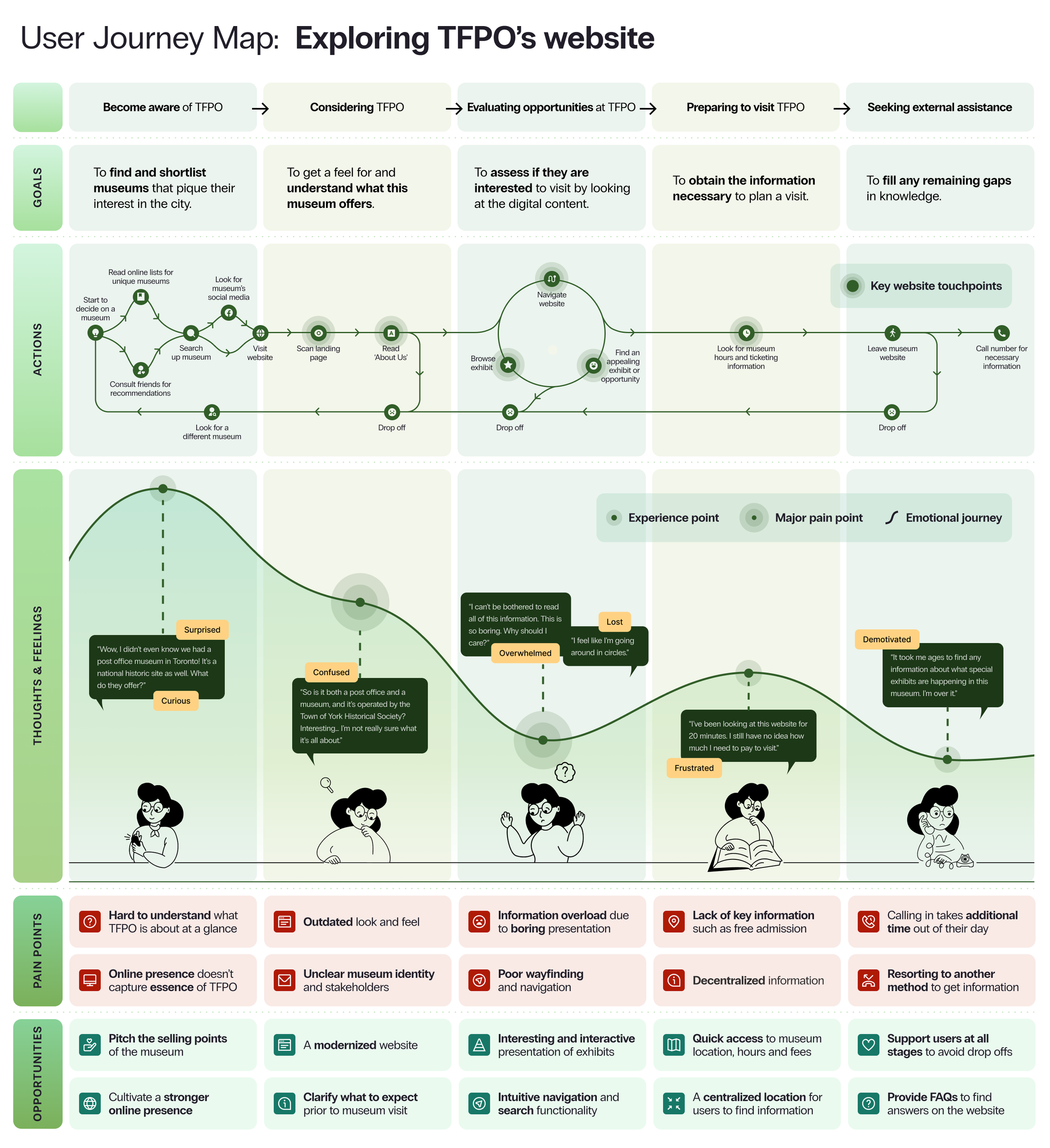
Mapping the current-state user journey
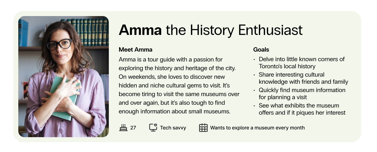
Based on our findings, we developed a user persona for our primary user group - Amma, the History Enthusiast — and we plotted the current user journey map to identify the key pain points across the key user flow of exploring exhibits to visit in the TFPO museum website.
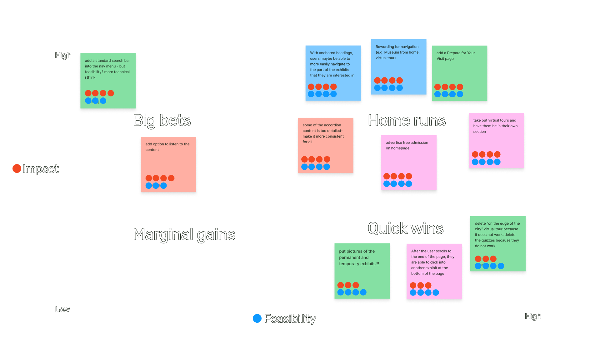
004: Ideation
Having now uncovered several user pain points , we brainstormed potential ideas to address them in the final design - focusing on navigation, accessibility, content, and information hierarchy and density. We then prioritized our ideas based on impact and feasibility.
005: Re-design process
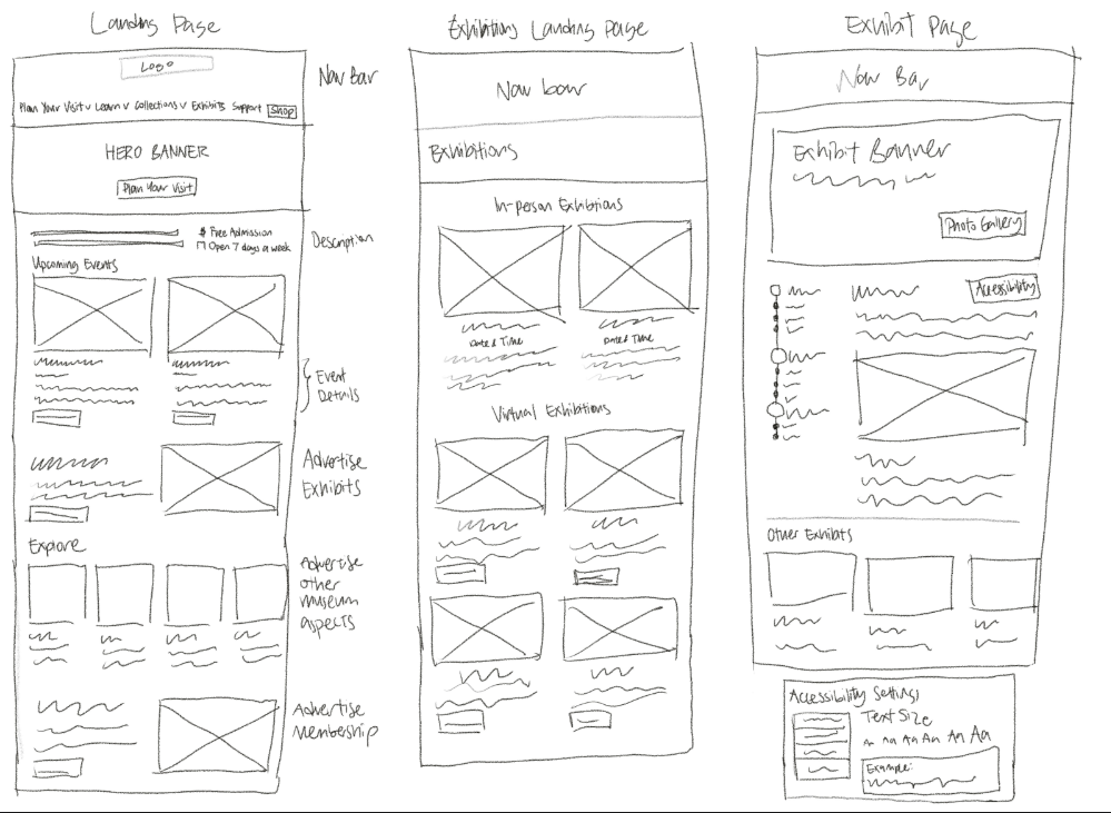
Low-fidelity prototype
Our team then started coming up with initial sketches to get our thoughts down on paper. New designs were created for all of the key touch-points including:
Home page
Exhibit landing page,
‘Museum From Home’ page
Virtual exhibit pages
‘Plan your visit’ page.
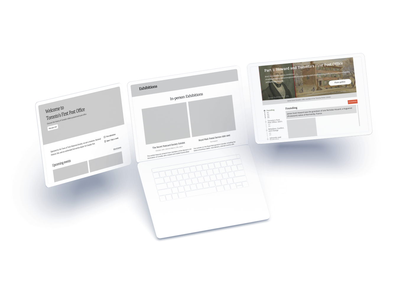
Mid-fidelity and usability testing
We then divided the pages to work on a mid-fidelity prototype and conducted usability testing with 5 museum goers on the mid-fidelity prototypes. We focused on the Home page, Exhibit landing page, and Exhibit pages pages as they were the ones originally included in the requirements from the partner.
Their insights provided valuable guidance on necessary improvements for the final design iteration.
Issues flagged included:
Ambiguity of abbreviations like "TYHS" for the newsletter,
Concerns about ongoing navigation menu clarity
Feedback on the interactive exhibit page timeline
Suggestions for enhancing accessibility settings.
006: Final TFPO website re-design
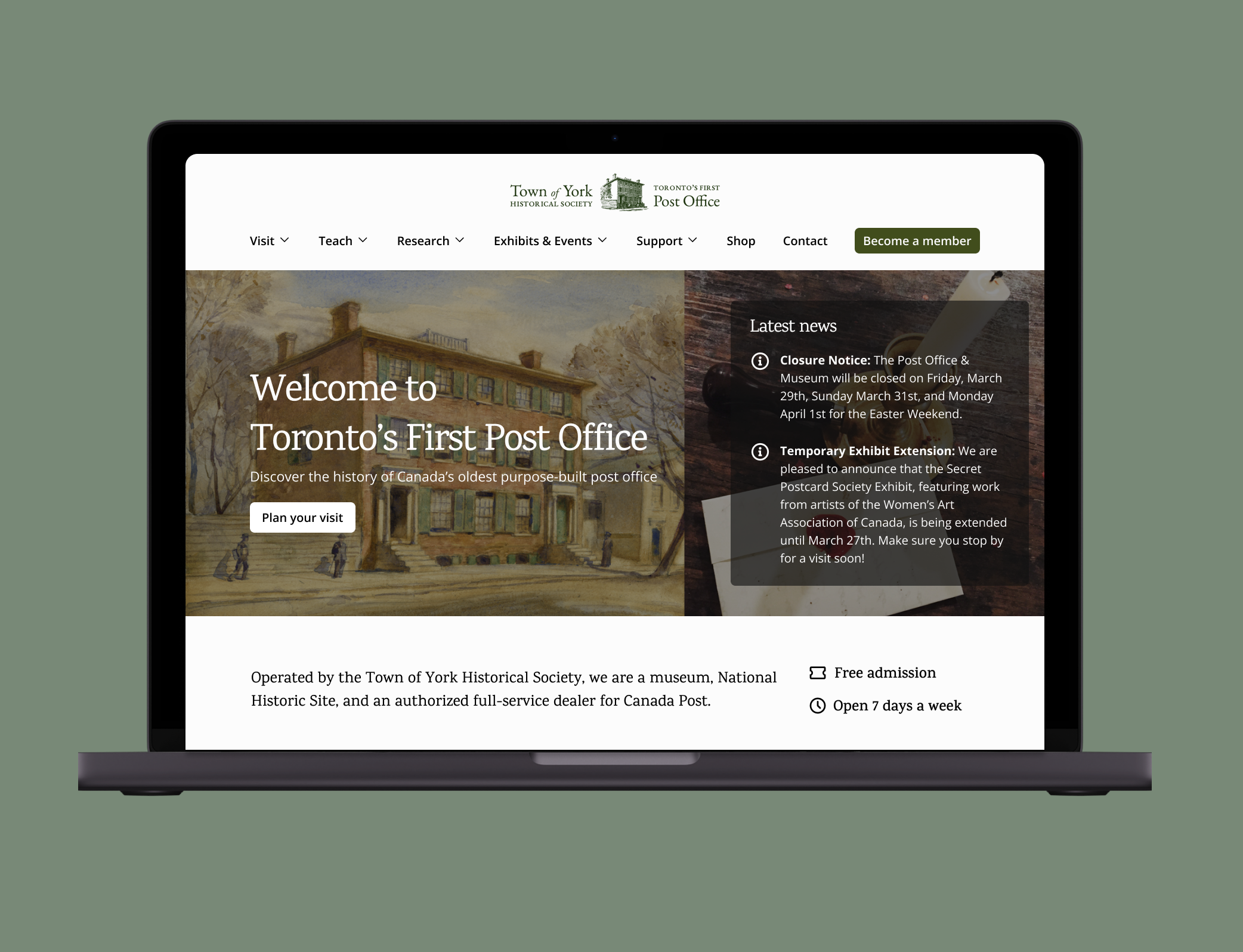
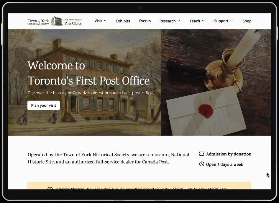
Get a quick snapshot of offerings
The revised home page page clearly presents the most salient tidbits front and center, such as the latest news, admission by donation, a description of the museum’s selling points, events, and membership.
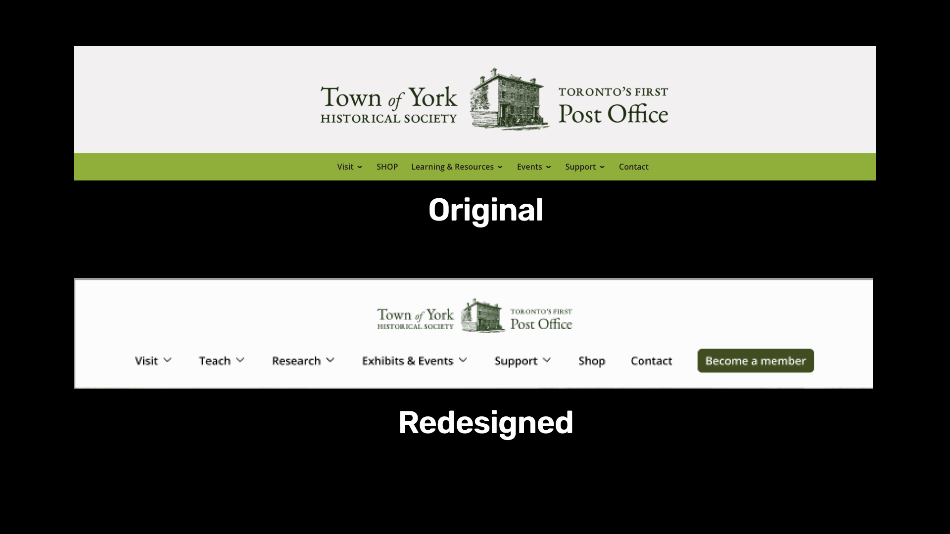
The page is more visual by using photos and icons, with increased color contrast, and cross-links to other parts of the website.
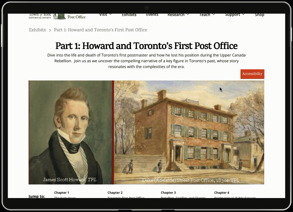
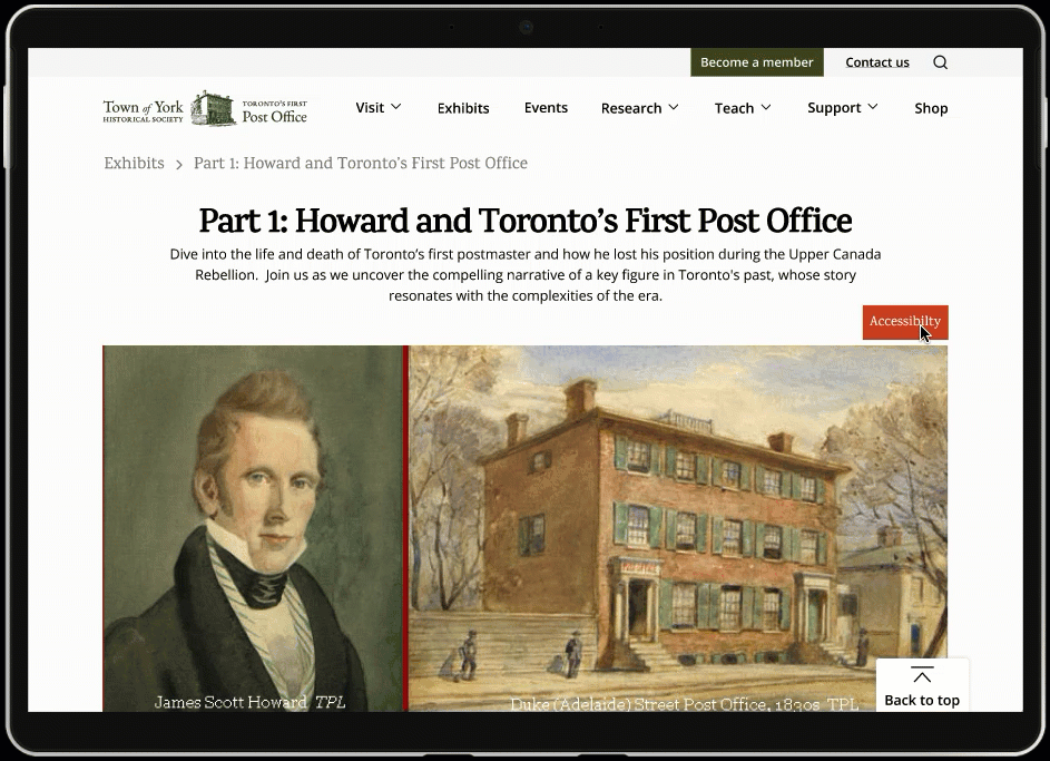
Immerse yourself in the exhibits
The exhibits page, exhibit pages, and educational activities are all more visual, less text-heavy, have better use of whitespace, and have more information hierarchy introduced.
In the exhibit pages, we also introduced an interactive timeline, photo gallery button and a link to other exhibits.
Find what you need, from events to educational resources
Our team introduced a task-oriented navigation system that better matches users’ mental models and removes museum jargon, and added breadcrumbs to every page, making it easier for users to find the information that they are looking for.
A more inclusive experience
The addition of accessibility menus, better color contrast, and alt-text improves accessibility to be more inclusive of a broader range of users.
Plan your museum visit
The newly designed ‘Plan Your Visit’ page supports users in obtaining the information necessary to plan a visit. Key visiting information is consolidated, such as the admission price, and museum opening hours.
By providing these key details in a dedicated page, it is easier for users to make plans to visit the museum in-person.

007: Reflections
Considering staff capacity and resource constraints in the redesign
The First Post Office Museum is a small non-profit organization operating with a small team, and they have been unable to allocate sufficient time and expertise to the development of the existing website. Because of that, our proposed solutions were intentionally designed to be user-friendly and minimize additional workload.
Working with a client experiencing organizational flux
During our engagement, the First Post Office Museum was at a pivotal point as they sought to re-imagine their branding, and consider changing their organization’s name. We met with our clients once a week and maintaining open communication regarding their organizational changes, so that we adhered to any new branding guidelines in the redesign.