


Vehicle Fatalities Infographic Re-design
Re-designing a cluttered infographic from Statistics Canada on passenger vehicle fatalities to illustrate the difference between male and female fatalities, using data from National Collision Database (NCDB) from Transport Canada in 2019.
Driving safety concerns displayed
Last summer, I came across a 2019 Statistics Canada infographic showing data about passenger vehicle fatalities in Canada. I sought to re-design the infographic to simplify, persuade, and to tell a compelling narrative about who is most impacted in passenger vehicle fatalities and in what ways.
Date completed
July 2023
Skillsets
Figma, Data visualization, Data analysis, Excel, presentation
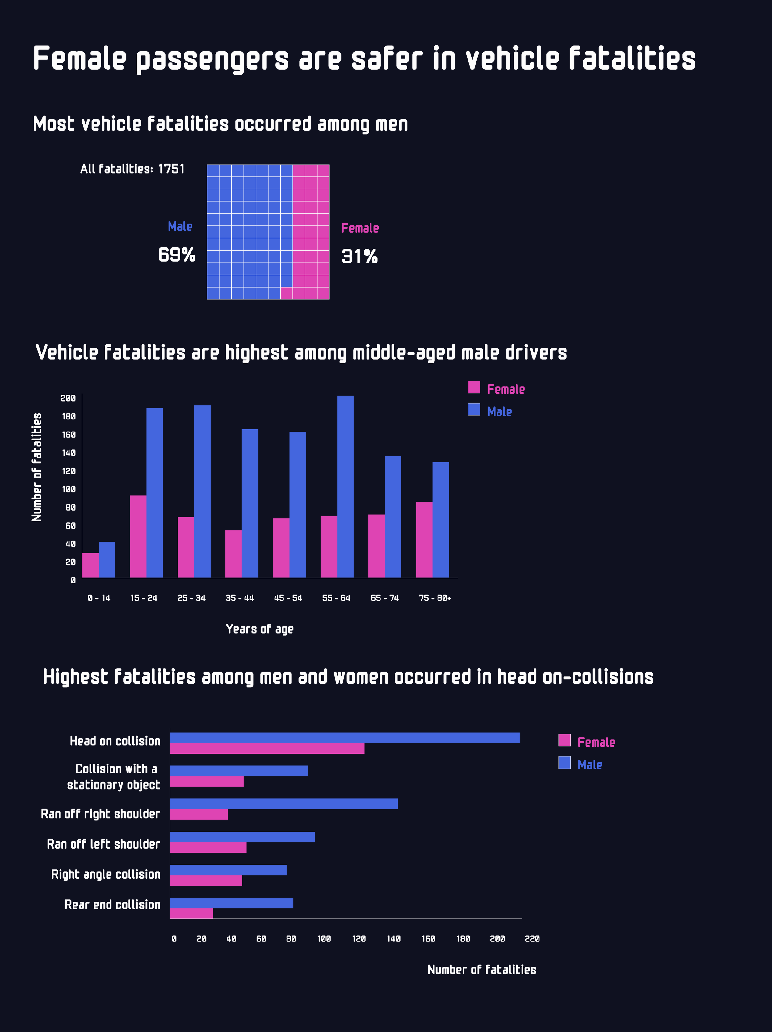
001: The Original Design
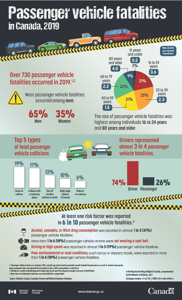
The original graphic has interesting data, but it is cluttered and overwhelming to read due to:
Heavy use of imagery and illustrations: The middle section has an illustration showing two cars that is too large and distracts from the data in the bars, and the use of color blocking to separate sections pulls focus to the center of the infographic.
Inconsistent styles and wide-ranging color palette: The two sets of bar charts in the middle section (showing the top 5 types of fatal passenger vehicle collisions; and the breakdown between drivers and passengers in vehicle fatalities) have a different style from each other, not just in the use of color palette but also in the use of shadowing.
Recurring use of text frames with bolded numbers and findings: The original graphic wastes a lot of space showing risk factors in vehicle collisions using text frames with bolded numbers, which is tiring for a viewer to read through and extract information from. The data showing passenger vehicle fatalities by gender could be more impactful and be better highlighted using a graphical representation such as a waffle chart instead of using separate text frames with numbers.
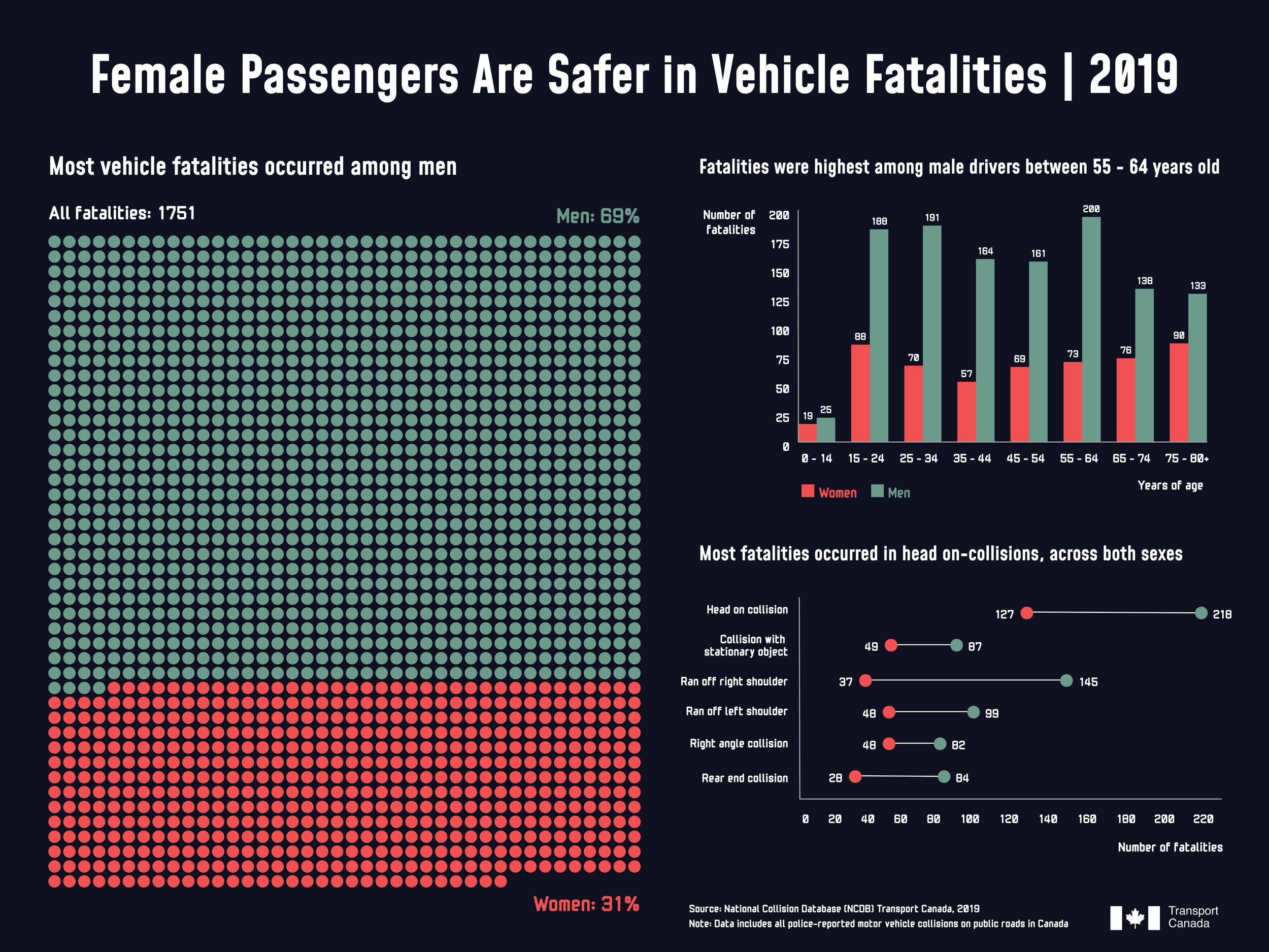
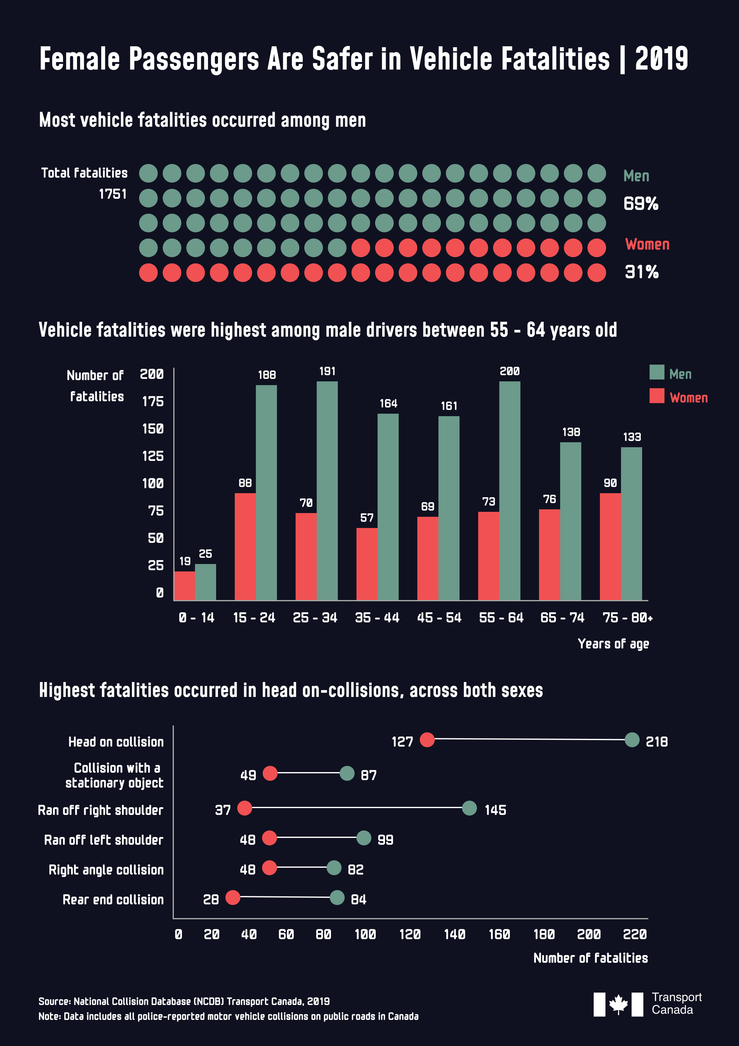
002: The Re-design
For the re-design, I opted to re-focus the graphic on the difference between male and female passenger vehicle fatalities, as the original graphic seeks to cover a vast ground of data that often seems loosely connected to each other and fails to tell a coherent story.
I drew on data from the National Collision Database (NCDB) from Transport Canada in 2019, rather than the source for the original graphic, Statistics Canada. After exploring the data, I decided to focus on three key findings:
Most vehicle fatalities occurred among men
Fatalities were highest among male drivers between 55 - 64 years of age
Most fatalities occurred in head-on collisions
003: Design Process
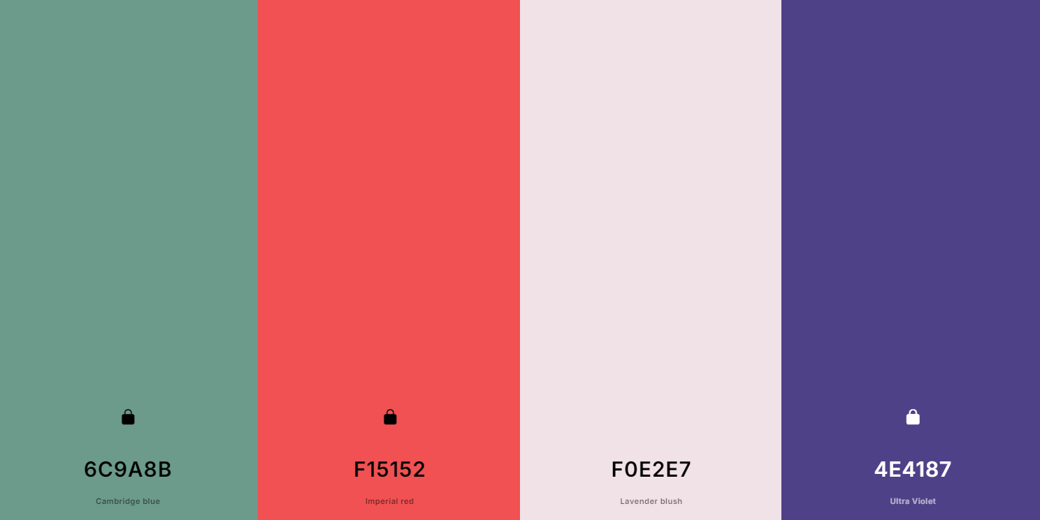
Minimalistic colour palette
While the original graphic uses a broad range of colours, I opted to use a minimal colour palette with more contrasting colours. I reduced the colour palette to only use two accent colours (Coral red and Cambridge blue), dark marine blue for the background, and white for the foreground text. To do so, I played around with various colour generators to find the perfect mix. Take a look at an example palette I generated - I only ended up using the red and blue shades shown here.
Creating a visually impactful infographic
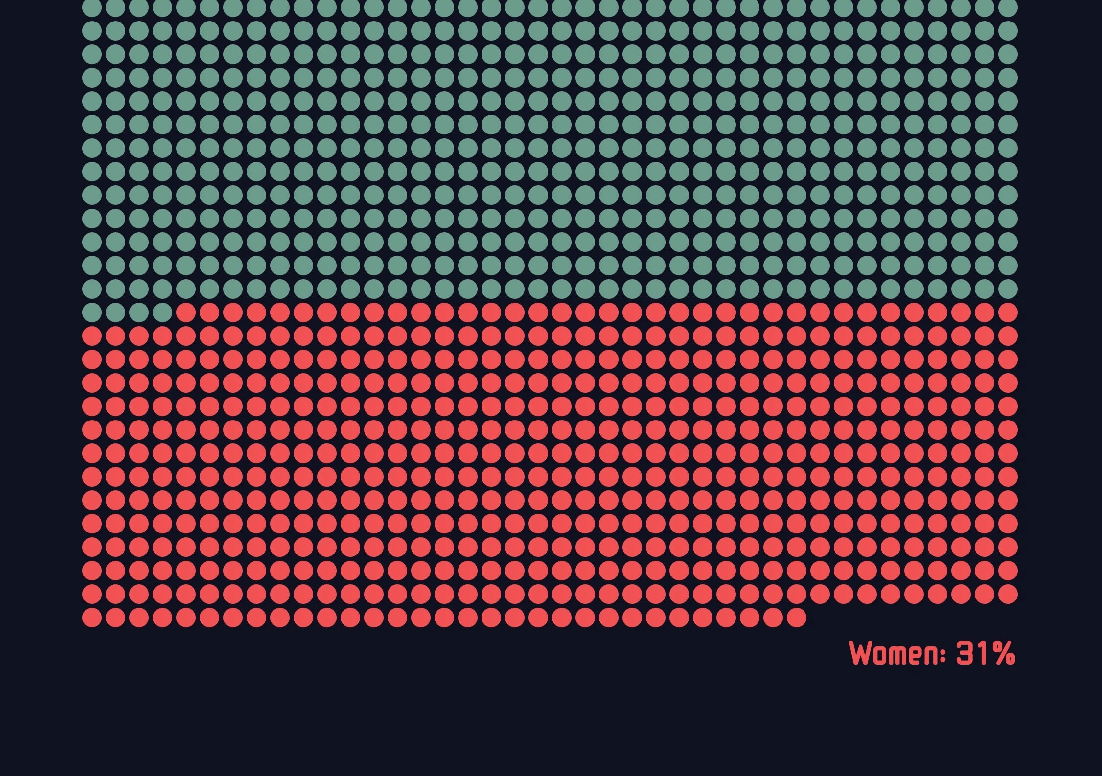
Rather than presenting the percentages of fatalities by gender using text frames with numbers, I opted to use a large unit chart to highlight the fatalities by gender, with the goal of making the chart more visually impactful. In the unit chart, each circle represents one fatality, and I’ve used colour to differentiate men (Cambridge blue) and women (Coral red).
For remaining half of the infographic on the right, I opted to use a bar chart at the top to show the number of fatalities per age group and used contrasting colours for each gender. I decided to use a flat 2D style without shadowing for the bar chart. I also used a horizontal dot plot to visually compare the number of fatalities by gender, per collision type.
Experimenting with the orientation and layout
When iterating on the re-design, I decided to change the orientation of the infographic from portrait to landscape, allowing me to draw attention to the unit chart showing the percentage of fatalities by gender. I went through multiple versions, and sought feedback from design peers throughout the process.
Reflections
Identifying when to remove surplus information
I decided to remove several elements of the original infographic as I found that they did not add, but rather detracted, focus away from the key findings in the data and the narrative that I wanted to convey. For example, I removed the information at the bottom of the original graphic showing risk factors since they felt supplementary and were not as critical in telling the story.
The gift of feedback and leveraging it to support continuous iteration
I went through a several iterations in an effort to make the graphic stronger and more visually impactful, and sought feedback from design peers at each stage to get their thoughts. I chatted with them in coffee chats, and received written feedback, helping me to advance the infographic with each iteration.